Outdoor advertising is a great way to create brand awareness. One popular way to advertise in the great outdoors is through the use of flying banners. Flying banners are easy to set up, portable and affordable and easy to update with new replacement skins. When selecting a banner for your business, there are a number of things you need to consider, apart from the location to display the sign, such as: size, message and colour. As the promotional material is competing with lots of other distractions, one important of these factors is colour choice.
The colour scheme of your banner can greatly affect the attention it receives. Most corporates already have a clear identity and restrictions in the use of their logo’s and colours, whilst some organisations have the opportunity to make a colour choices for their banners. The following lists some of the most popular colour combinations used in outdoor advertising and what they can represent:
Red and yellow
Both yellow on red and red on yellow are commonly seen in signage across the world. McDonalds is a great example of the use of red and yellow in signage. Both are bright, engaging colours that are known for bringing about feelings of happiness and even hunger.
Black and white
Another classic is black and white. Typically, black text and visuals on a white background is used to convey a clear, concise message. The use of such stark colours makes a bold statement and does not give the reader too many emotions, making it ideal for banners that convey a simple message or advertise a more serious service.
Blue with white or yellow
Blue is a calm, corporate colour often used for large organisations. It conveys business confidence. The use of white further exemplifies this. Yellow, as a happy colour, softens the corporate feel, making it more appropriate for other industries and smaller businesses.
Other Combinations
Other popular colour combinations include green and white and brown and white. Green is often used to demonstrate health or a more ecofriendly way of living, while brown is a rich, warm colour, often representing class.
When choosing the colour scheme for your banner, remember to keep it simple and engaging. Try not to have more than three main colours and ensure the message the banner conveys is clear. Choosing contrasting colours for the background and the words will help.
It is a good idea to discuss your colour selections with your designer or printer, because your colour selection and specification can affect the printed end result. Find out how the colour prints on the fabric that you have selected. For example, on some fabrics red and yellow together can cause bleeding of the colours. When choosing white text, you should be aware that fading is more noticeable, as once the background fades, the text disappears, and it will be harder to read.
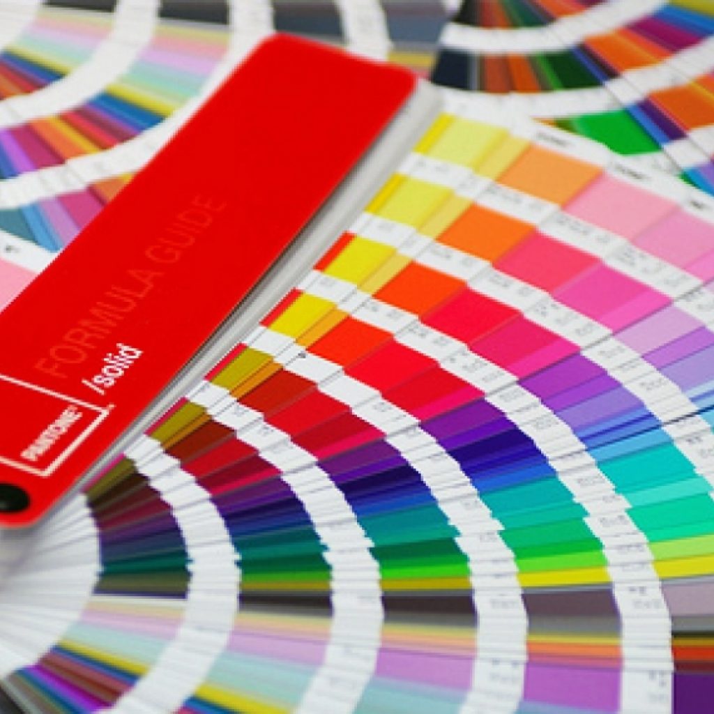
Always select Pantone colours to ensure a correct colour match to your chosen colour. Selecting colours from on-screen and RGB colour mixes are not advisable as this can result in disappointing colour variations in the end product.
Where you locate your signage also plays a part in colour selection. A dark green banner that is to be placed is in front of trees or foliage will not be very noticeable as it will blend into the background. Similarly, a brown or beige background banner will not be noticed if placed in front of a concrete wall .
For more advice or to create your own flying banner, talk to the experts at Expandasign on 1300 270 058 today.

